Trying out some of Co2 Calculators out there we came to the following problems for the User
discussion | results
Looking at the other calculators we wanted our App to be | send the following message to the user :
less complicated
giving a fast result
less judging
giving a more positive outcome to the user
app features
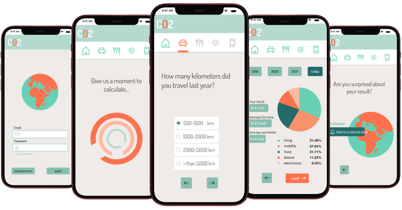
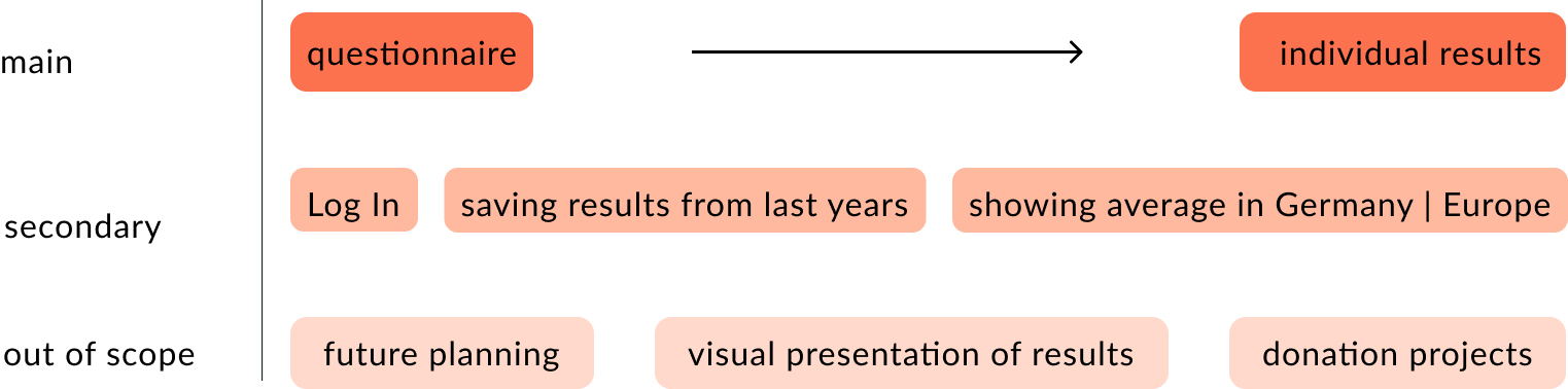
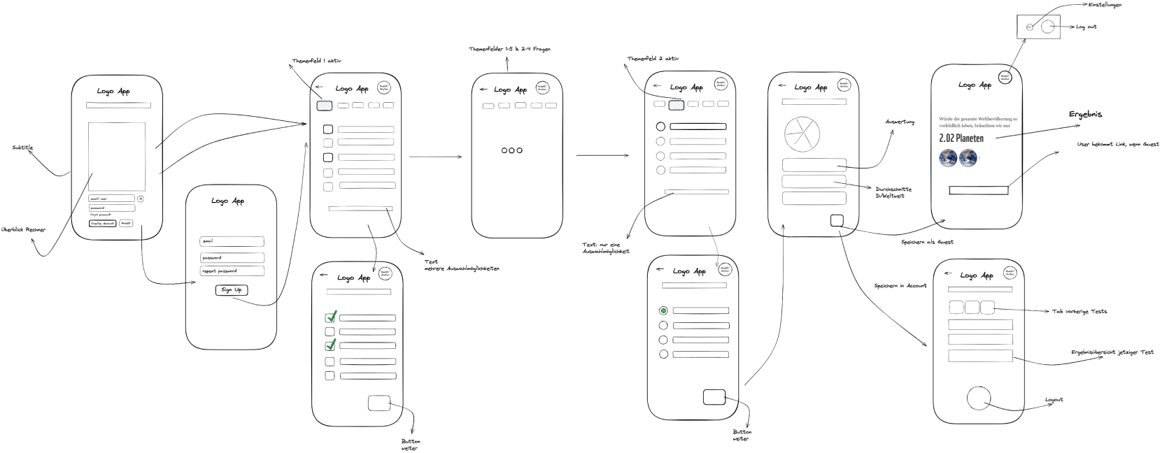
We concentrated on building the main features the questionnaire so the user gets individual results first and thought about more fatures like Log In screens, creating an account and more infos about the individual results next.
In-App Questionnaire
Another collaborational part of our work was to find maintopics to ask the user in our calculator via Figjam.
mobility & travel
living
food
leisure
electronics
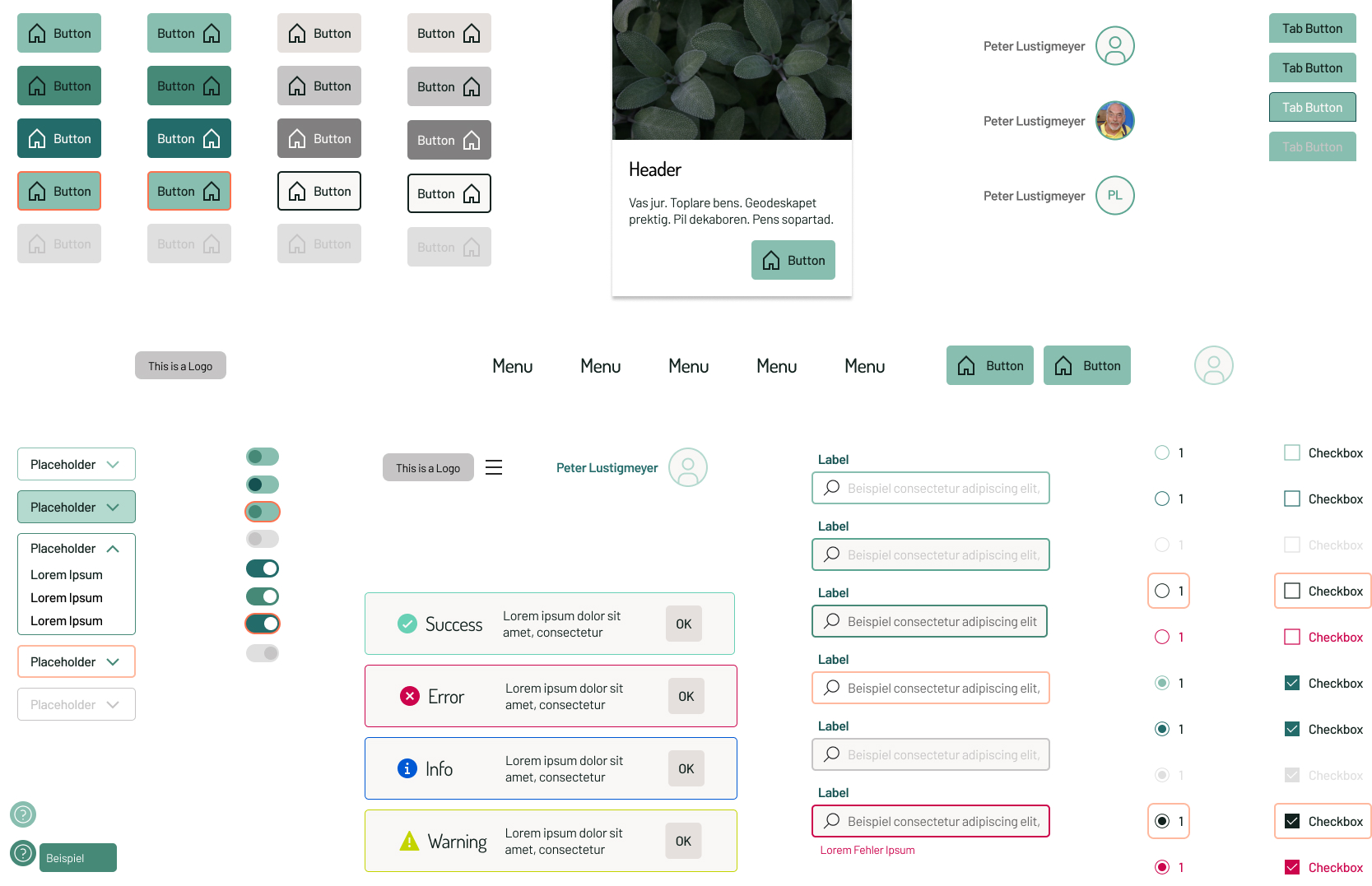
Design system | style guide
fonts & colour
mobility & travel
living
food
leisure
electronics
primary #468977
secondary #F7926A
neutral #E5E0DD
Design system | components
We split up to built some of the main components we will later use for the app.
wireflow
To structure our ideas for all features we did some wireframes which we adapted after the first round of designing. account and more infos about the individual results next.
the design
We concentrated on building the main features the questionnaire so the user gets individual results first and thought about more fatures like Log In screens, creating an account and more infos about the individual results next.
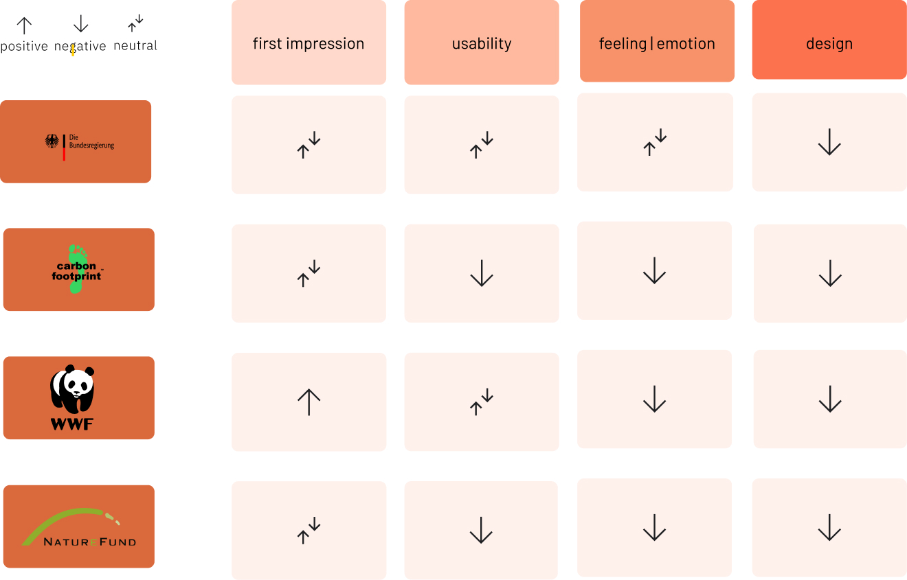
Usertesting
We conducted Usertesting with one user. I got the part to lead the user through the test and interview at the end . From the feedback to the interview I learned not to give the user so much advice while testing the app. This will bring a better result in the end and I will take this to the next interview I will have to do.
+
very nice layout
font size very readable
contrast and spacing
icons in taskbar as optical guidance
design
-
too few icons in questions, need for
more images
link button on last page wrong color
+
self-explanatory navigation
Usability
-
bike option was not clickable
not able to save Radio buttons
wish for more functions (Battle with friends, share result via social media)
+
content
-
detailed evaluation not sufficient – need for more diagrams
spelling mistakes in units of measurement
entertainment devices: not enough options (no device, cinema)
household appliances: microwave & grill missing consume goods: word misleading & amount too high
video at the end – expected something else (Found it funny anyway)